A mixed media piece I created to show how negative and positive words can influence our lives. The negative words in this piece from a diving board as the diver dives off of it, into the positive words in the water. I wanted to show how the diver is choosing to break away from the negativity, and diving headfirst into the positive.
diving headfirst into hope
18x24 japanese sumi ink, newspaper, and magazines
2026
This still life was a self directed piece and was my first time experimenting with Japanese Sumi Ink. I concentrated on recording shadow shapes while using a reductive value scheme to suggest form.
Light and Shadow
18x24 sumi ink on paper
2026
Losing touch with reality
18x24 Colored pencil on paper
2026
This was a self-directed piece inspired by my trip to Lake Tahoe. I took an amazing picture of my friend taking a picture, and I decided to go beyond just drawing that image. I wanted to explore the idea of walking into a puddle and taking a moment to look at the reflection, reminiscing about my time in Lake Tahoe and losing touch with reality. I made this piece because I felt it captured imagination and fantasy.
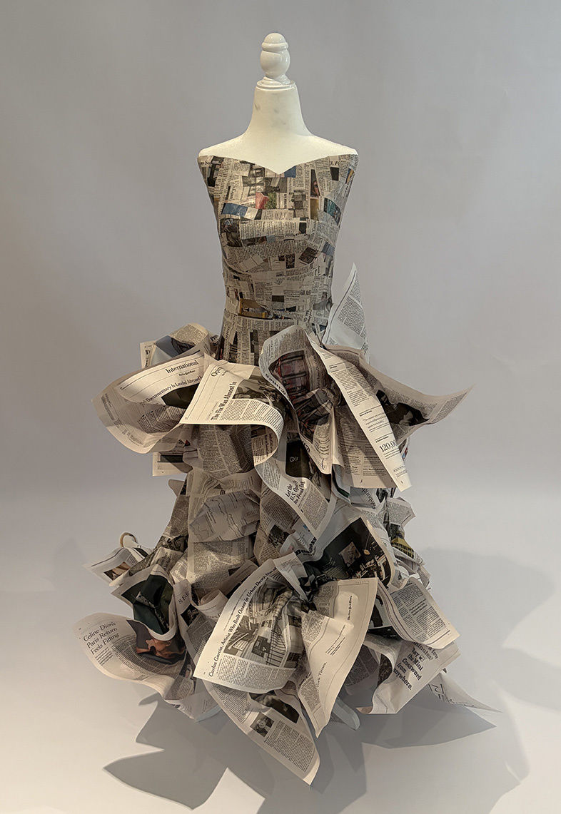
Creating this piece, I wanted to explore the connection between, fashion, sculpture and atypical materials. I yearned to challenge myself to turn normal newspaper, something that is sometimes forgotten about nowadays with technology, into a unique dress. I used a paper mache process to create the bodice of the dress. I layered multiple pieces on top of each other going vertical and horizontal to create a strong base. For the bottom part of the dress, I folded and scrunched layers of newspaper in different ways to create a voluminous and dramatic result. I was fascinated how a super delicate everyday material could be remodeled into fashion.
Dress to imPress
newspaper and paper mache
2026

This piece was inspired by the painter Al Held and my interest in learning more about linear perspective. I explored how linear perspective can transform a flat surface into a three-dimensional space, using near and far objects to create a sense of depth. I used multiple vanishing points to guide my lines and build the shapes in the composition. I chose sumi ink because it allowed me to create precise, defined lines and bold contrast.
Perspective
18x24 sumi ink on paper
2026
I made this colored pencil self-portrait from a photograph I took of myself. Even though I am used to seeing my reflection every day, I wanted to challenge myself to focus on the small details that make me unique. I layered, blended, and shaded with colored pencils to capture my skin tone, shadows, and expression. This piece allowed me to share how I see myself through my art.
Hello, my name is
9x9 colored pencil on paper
2026
I wanted to combine my love for pop art and Banksy in this piece. I have always been drawn to pop art because of its playful imagery. At the same time, I have been inspired by Banksy's creative wall murals. By combining both influences, I wanted to capture elements of each style. In an art class I took, I made a pop art piece in ink. I wanted to explore it further and see what other potential the piece had. One day, I photographed this brick wall and decided it would be a perfect opportunity to bring both influences together. The woman's dress being the same color as the surfer's skin is meant to represent her sunburn from surfing, and vice versa, with the surfer's pale bathing suit being the same color as the woman's skin.
Pop goes the sunscreen
9x12 ink on paper and photoshop
2026


This piece captures a moment shared with my mother as she braids my hair, something she has done since I was a little girl. Things change as we transition from childhood into adulthood, and even though I've grown to be more independent, this routine has remained. Through this piece, I wanted to preserve one of my many childhood moments. I also wanted it to represent how getting older doesn't always mean leaving all parts of childhood behind, but instead can mean taking certain memories with us through life.
Meaningful ties
9x12 Colored pencil on paper
2026
I created this charcoal portrait of my father because I wanted to capture someone who plays such an important role in my life. My dad is someone I look up to, and I wanted to express the appreciation, respect, and admiration I have for him through my artwork. For this reason, I chose a strong value scheme with high contrast and used charcoal because it works well to achieve this effect.
Essence of him
18x24 Charcoal on paper
2026
I made this piece by observing a still life statue during my class at Parsons School of Design. I was drawn to the figure because it represents power and strength. I experimented with coffee as a unique medium that I thought could portray a sense of movement and force through its natural splatters and unpredictable finishes. The pencil defines the statue's structure, while the white ink brings out the highlights. I wanted to bring life and movement to a stationary statue, emphasizing its power and strength through the different materials I used.
Power and strength
9x12 Coffee with graphite, white ink and colored pencil on paper
2026


This piece explores the theme of childhood through an assortment of objects that hold meaning and value in my life. The ballet slippers, Hello Kitty wallet, and photograph of my siblings and me symbolize some of my childhood memories. The piece explores the nostalgia associated with growing up. Many people have a storage bin like this one tucked away in their attic, filled with old belongings they may have forgotten about. My intent was to capture the relatable experience of childhood memories being tucked away and found many years later.
Memories Stored Away
18x24 Colored Pencil on Paper
2026
This expressive figure study was done during a model session in an art class I took at Parsons School of Design. This piece allowed me to further explore human anatomy and proportion. As I layered and blended the colored pencils, I focused on the body's contours, as well as light and shadow.
Bare
11x14 Colored Pencil on Paper
2026
In art class, we were directed to draw near and far objects. After my visit to the west coast discovering an in-N-Out Burger unexpectedly close to the deserts in Las Vegas, I created this cowboy making it a unique western piece. I thought it would be interesting to combine these unconventional scenarios together.
A fistful of fries - named for an iconic western movie
9x12 Pencil on Paper
2026


This was a self-directed piece inspired by my trip to Lake Tahoe. I took an amazing picture of my friend taking a picture, and I decided to go beyond just drawing that image. I wanted to explore the idea of walking into a puddle and taking a moment to look at the reflection, reminiscing about my time in Lake Tahoe and losing touch with reality. I made this piece because I felt it captured imagination and fantasy.
Losing touch with reality
18x24 Colored pencil on paper
2026
Light and Shadow
18x24 sumi ink on paper
2026
This still life was a self directed piece and was my first time experimenting with Japanese Sumi Ink. I concentrated on recording shadow shapes while using a reductive value scheme to suggest form.
diving headfirst into hope
18x24 japanese sumi ink, newspaper, and magazines
2026
A mixed media piece I created to show how negative and positive words can influence our lives. The negative words in this piece from a diving board as the diver dives off of it, into the positive words in the water. I wanted to show how the diver is choosing to break away from the negativity, and diving headfirst into the positive.
A fistful of fries - named for an iconic western movie
9x12 Pencil on Paper
2026
In art class, we were directed to draw near and far objects. After my visit to the west coast discovering an in-N-Out Burger unexpectedly close to the deserts in Las Vegas, I created this cowboy making it a unique western piece. I thought it would be interesting to combine these unconventional scenarios together.
This expressive figure study was done during a model session in an art class I took at Parsons School of Design. This piece allowed me to further explore human anatomy and proportion. As I layered and blended the colored pencils, I focused on the body's contours, as well as light and shadow.
Bare
11x14 Colored Pencil on Paper
2026
This piece explores the theme of childhood through an assortment of objects that hold meaning and value in my life. The ballet slippers, Hello Kitty wallet, and photograph of my siblings and me symbolize some of my childhood memories. The piece explores the nostalgia associated with growing up. Many people have a storage bin like this one tucked away in their attic, filled with old belongings they may have forgotten about. My intent was to capture the relatable experience of childhood memories being tucked away and found many years later.
Memories Stored Away
18x24 Colored Pencil on Paper
2026
I made this piece by observing a still life statue during my class at Parsons School of Design. I was drawn to the figure because it represents power and strength. I experimented with coffee as a unique medium that I thought could portray a sense of movement and force through its natural splatters and unpredictable finishes. The pencil defines the statue's structure, while the white ink brings out the highlights. I wanted to bring life and movement to a stationary statue, emphasizing its power and strength through the different materials I used.
Power and strength
9x12 Coffee with graphite, white ink and colored pencil on paper
2026
This piece captures a moment shared with my mother as she braids my hair, something she has done since I was a little girl. Things change as we transition from childhood into adulthood, and even though I've grown to be more independent, this routine has remained. Through this piece, I wanted to preserve one of my many childhood moments. I also wanted it to represent how getting older doesn't always mean leaving all parts of childhood behind, but instead can mean taking certain memories with us through life.
Meaningful ties
9x12 Colored pencil on paper
2026
I created this charcoal portrait of my father because I wanted to capture someone who plays such an important role in my life. My dad is someone I look up to, and I wanted to express the appreciation, respect, and admiration I have for him through my artwork. For this reason, I chose a strong value scheme with high contrast and used charcoal because it works well to achieve this effect.
Essence of him
18x24 Charcoal on paper
2026
I wanted to combine my love for pop art and Banksy in this piece. I have always been drawn to pop art because of its playful imagery. At the same time, I have been inspired by Banksy's creative wall murals. By combining both influences, I wanted to capture elements of each style. In an art class I took, I made a pop art piece in ink. I wanted to explore it further and see what other potential the piece had. One day, I photographed this brick wall and decided it would be a perfect opportunity to bring both influences together. The woman's dress being the same color as the surfer's skin is meant to represent her sunburn from surfing, and vice versa, with the surfer's pale bathing suit being the same color as the woman's skin.
Pop goes the sunscreen
9x12 ink on paper and photoshop
2026
I made this colored pencil self-portrait from a photograph I took of myself. Even though I am used to seeing my reflection every day, I wanted to challenge myself to focus on the small details that make me unique. I layered, blended, and shaded with colored pencils to capture my skin tone, shadows, and expression. This piece allowed me to share how I see myself through my art.
Hello, my name is
9x9 colored pencil on paper
2026
This piece was inspired by the painter Al Held and my interest in learning more about linear perspective. I explored how linear perspective can transform a flat surface into a three-dimensional space, using near and far objects to create a sense of depth. I used multiple vanishing points to guide my lines and build the shapes in the composition. I chose sumi ink because it allowed me to create precise, defined lines and bold contrast.
Perspective
18x24 sumi ink on paper
2026
Creating this piece, I wanted to explore the connection between, fashion, sculpture and atypical materials. I yearned to challenge myself to turn normal newspaper, something that is sometimes forgotten about nowadays with technology, into a unique dress. I used a paper mache process to create the bodice of the dress. I layered multiple pieces on top of each other going vertical and horizontal to create a strong base. For the bottom part of the dress, I folded and scrunched layers of newspaper in different ways to create a voluminous and dramatic result. I was fascinated how a super delicate everyday material could be remodeled into fashion.
Dress to imPress
newspaper and paper mache
2026